Leona Frett, CEO of marketing and research agency Frett Knott Group, was relaunching the business. Along with the relaunch, we were asked to revamp their branding which had become a little dated over time. FKG wanted something simple and clean yet eye catching.
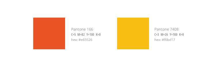
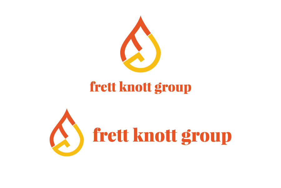
Our first task was doing a refresh of the brand colors. The original colors were dark and medium shades of orange and we didn’t want to stray too far from that. We ended up using a bright orange and yellow as the main brand colors. From our concepts for their logo, we found that the F and G arranged to resemble a flame from a match or candle worked really well with the new brand colors.


